From airports to hospitals, kiosks are now part of daily life. Whether you’re printing a boarding pass, ordering food or checking in at a clinic, these experiences depend on thoughtful UI design.
When a kiosk interface is confusing, the impact is immediate: long lines, frustrated users and abandoned transactions. But when the kiosk screen design is clear, it builds confidence, reduces errors, and keeps customers moving.
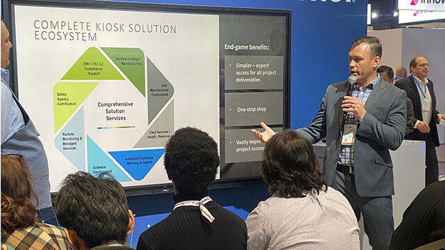
In this guide, we’ll share six ways KIOSK creates intuitive, inclusive interfaces—highlighting interactive kiosk examples that show what great interface design looks like in action.
1. Make Touchpoints Simple and Stress-Free
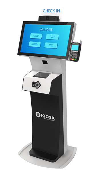
The foundation of strong kiosk UI design is simple, stress-free touchpoints. When buttons are too small or tightly packed, users make mistakes, especially in high-traffic areas where they may be rushed or distracted.
Best practices for kiosk screen design include:
- Button sizes of at least 20 mm with clear spacing
- Placement patterns that match real-world usage
- Action labels that are large, clear and consistent (“Pay Now,” “Cancel”)
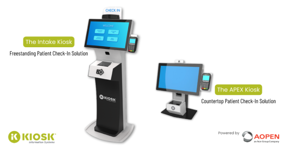
For example, in kiosk interface design examples from retail, self-checkout kiosks with larger buttons reduce mis-taps and speed up transactions. In healthcare, spacious on-screen keyboards help patients check in more easily.
At KIOSK, we design every kiosk interface with accessibility and accuracy in mind. With our customer software managing layouts and updates, businesses can cut errors, reduce frustration and build trust in self-service solutions.
2. Guide Users with Clear Navigation and Progress Cues
Clear navigation is one of the simplest ways to reduce confusion and abandonment. When users know where they are in a process, they’re more likely to complete it.
Best practices for kiosk UI design include:
- Progress bars to show how many steps remain
- Step indicators to reassure users the kiosk interface is working
- Back buttons for easy error correction
- Confirmation screens to verify details before submission
For example, airport kiosks with progress bars and validation cues give travelers confidence and keep lines moving. At KIOSK, we design navigation flows with these kinds of cues built in, helping users move smoothly from start to finish.
3. Break Language Barriers with Multi-Language Interfaces
Language should never prevent someone from using a kiosk interface. In diverse, public-facing spaces, multi-language support makes self-service accessible and welcoming.
Best practices for kiosk interface design include:
- Placing language toggles on the home screen
- Ensuring accurate, consistent translations
- Designing layouts that adjust to text length
- Making it easy to add or update languages
You’ll see these features in interactive kiosk examples across airports, restaurants and patient check-ins. With KIOSK’s custom software, updates roll out centrally—broadening inclusivity and reducing abandoned sessions caused by language barriers.
4. Ensure Accessibility Beyond Compliance
Accessibility isn’t just about meeting ADA requirements. It’s about ensuring anyone can use your kiosk with ease. That means addressing both physical setup and digital design.
- Physical design: Mounting height and reach ranges for wheelchair users, adequate floor space for mobility aids and angled screens that reduce glare.
- Digital design: High-contrast visuals, adjustable font sizes, screen reader compatibility, audio prompts and tactile or headphone options for multi-sensory guidance.
For example, angled retail kiosks improve visibility for seated users, while headphone jacks provide audio instructions for people with limited vision. These features not only expand accessibility but also increase customer loyalty by making kiosks usable for seniors, non-native speakers and those with temporary injuries.
At KIOSK, accessibility is built into our design process and maintained with regular software updates—ensuring kiosks remain inclusive for all users.
5. Create Consistent Workflows Users Can Trust
Consistency builds confidence. A customer who uses a kiosk in one location should feel comfortable using the same type elsewhere without relearning the process.
Elements of consistent kiosk UI design include:
- Predictable navigation (Next, Back, Confirm)
- Standard button placement across screens
- Uniform icons and terminology
- A shared design language across deployments
For example, consistent retail ordering kiosks shorten the learning curve, while predictable transportation check-in flows reduce passenger stress. At KIOSK, we design workflows that stay uniform across industries, making every kiosk interface intuitive, reliable, and easy to use.
6. Improve Interfaces Continuously with Data Insights
Great kiosk interface design isn’t static. It evolves with real-world use. Data and analytics show where users struggle, abandon transactions or repeat errors, giving businesses the insights needed to refine their kiosk UI over time.
With KIOSK’s platform, businesses can:
- Track completion rates and drop-off points
- Monitor error frequency in fields or screens
- Gather customer feedback for targeted improvements
For example, if analytics reveal high abandonment at the payment step, simplifying the kiosk interface streamlines choices and keeps the experience aligned with expectations. With KIOSK’s software platform enabling remote monitoring and updates, refinements roll out quickly—keeping interfaces current, consistent and user-friendly.
By combining software insights with design expertise, KIOSK keeps every interactive kiosk intuitive, efficient and effective long after deployment.
Elevate Self-Service with KIOSK’s UI-First Approach
A well-designed kiosk UI is more than just functional. It’s an extension of your brand. By focusing on touchpoints, navigation cues, multi-language support, accessibility, consistent workflows and data insights, you can turn self-service into a seamless customer experience.
At KIOSK, we merge hardware expertise with user-centered software to deliver solutions that are intuitive, inclusive and effective across industries.
Ready to see how better kiosk interface design can transform your business? Contact us today or explore our kiosk solutions to get started.
FAQ: KIOSK UI
Kiosk UI often raises questions for businesses considering self-service. Here are quick answers to some of the most common ones.
What makes a good kiosk UI?
A good kiosk UI is simple and intuitive, with clear navigation, large touchpoints, and consistent workflows. These elements reduce frustration and friction, prevent errors and minimize abandoned transactions.
How does kiosk UI improve accessibility?
A kiosk UI can enhance accessibility by incorporating features such as high-contrast visuals, adjustable fonts and multilingual support. These tools ensure kiosks are usable for people of all abilities and backgrounds.
Why is consistency important in kiosk design?
Consistency is important in kiosk design because predictable workflows reduce stress and shorten the learning curve. Uniformity builds user confidence and streamlines experiences across multiple deployments.
What kind of software do kiosks use?
Kiosks use specialized software that integrates hardware with user-friendly interfaces. This software manages secure transactions, supports accessibility features and ensures a consistent UI across your entire deployment.